Gr-r-reat
Beginnings
WK Kellogg Co Brand Identity
Client: WK Kellogg Co
Project: Brand Identity
Studio: Brunswick Creative
Role: Designer
Year: 2023
Custom Typeface: XYZ Type
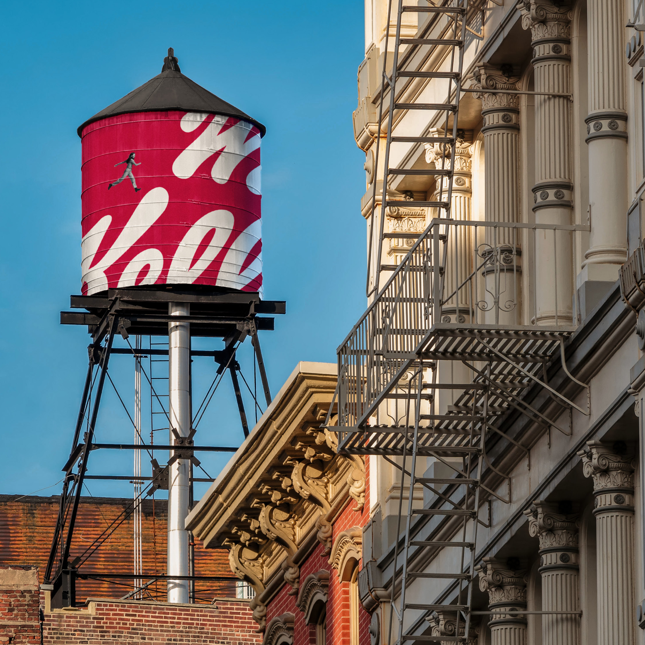
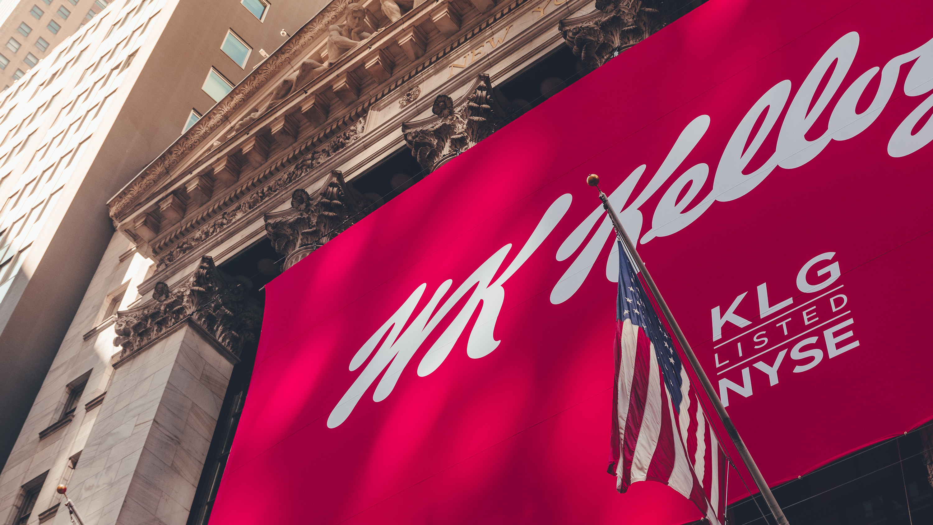
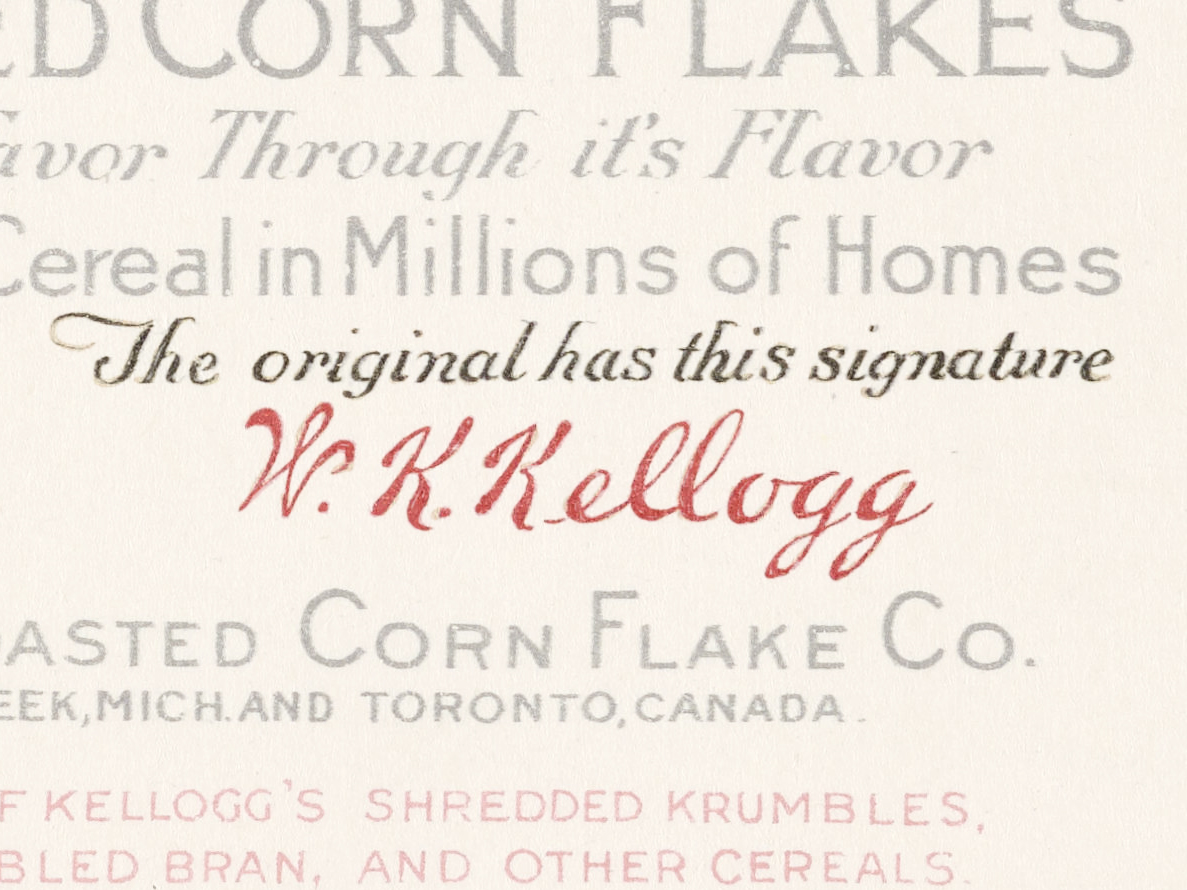
The first box of Kellogg’s Corn Flakes included the signature of its founder and creator William K. Kellogg. It was accompanied by the slogan, “The original has this signature”. 117 years later that signature still stands as a beacon for quality, joy, and innovation and is a building block for the visual identity of the newly formed WK Kellogg Co.
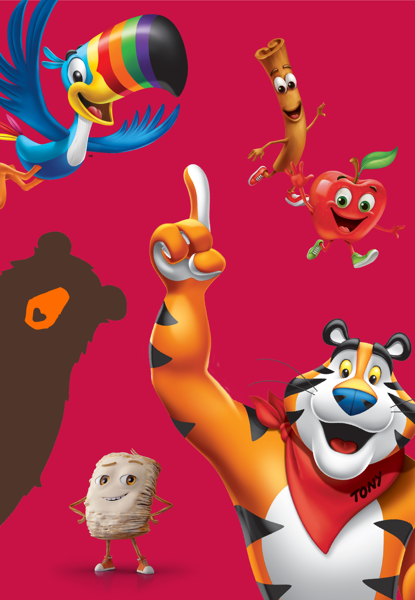
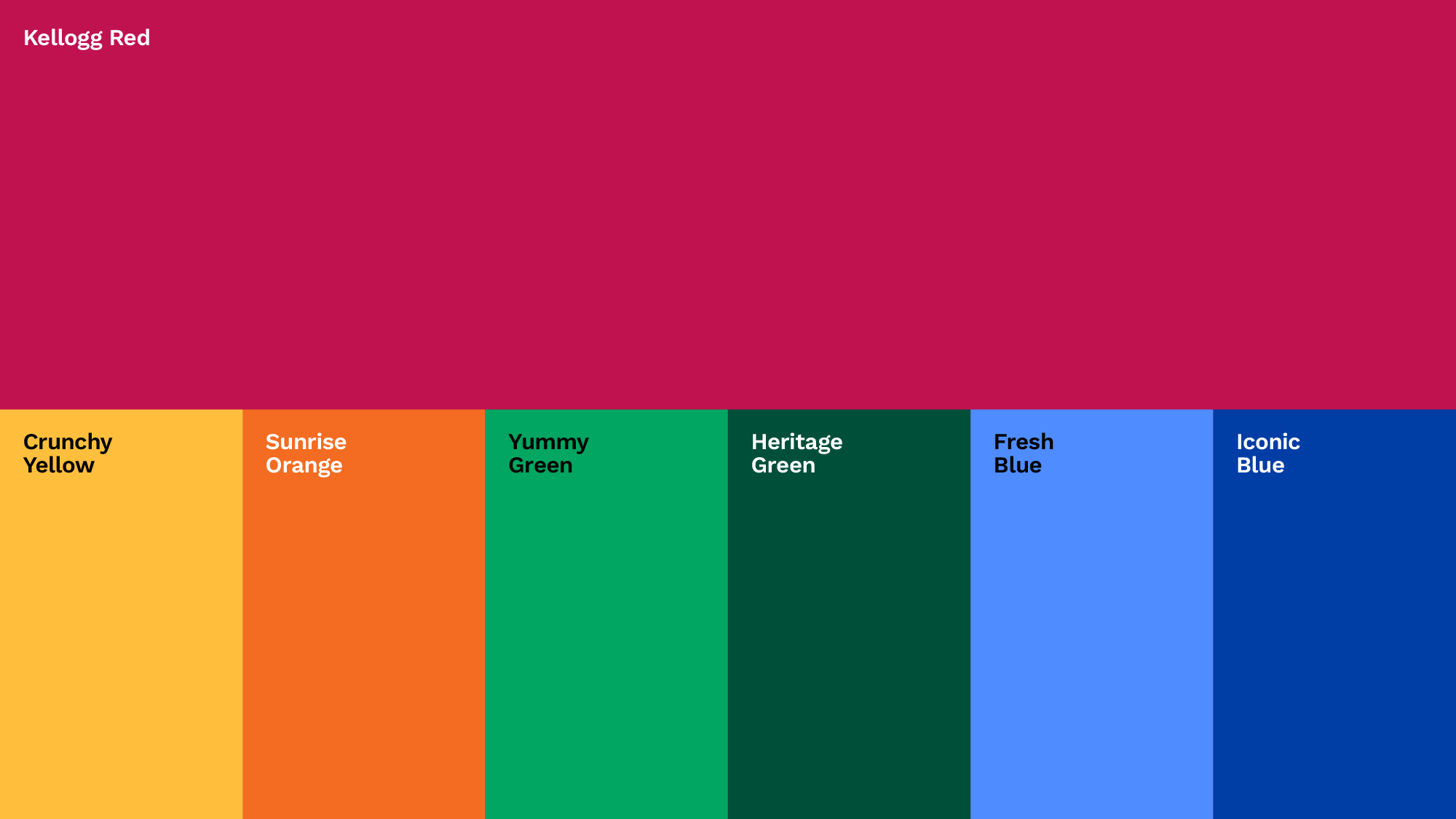
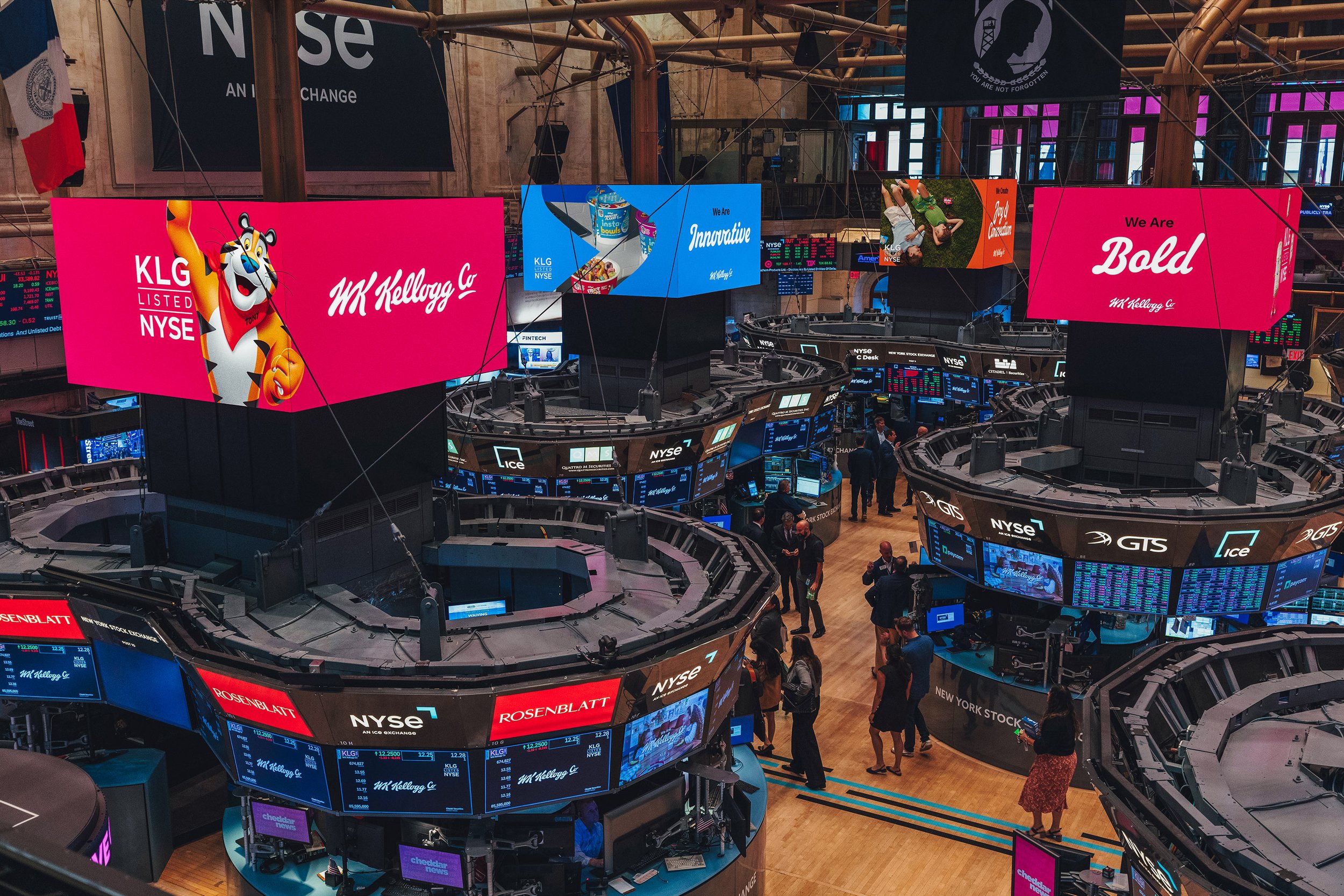
All the elements of the identity work together to build upon that legacy, elevating it to new heights. From the scripted logo, to the custom typeface inspired by his signature, to the iconography system that looks as if it has been drawn by his own pen, to the warm yet vivid colors that evoke their most iconic brands—the visual identity manifests the fact that a century-old company can be bold, high-spirited, and full of new ideas.
Signature
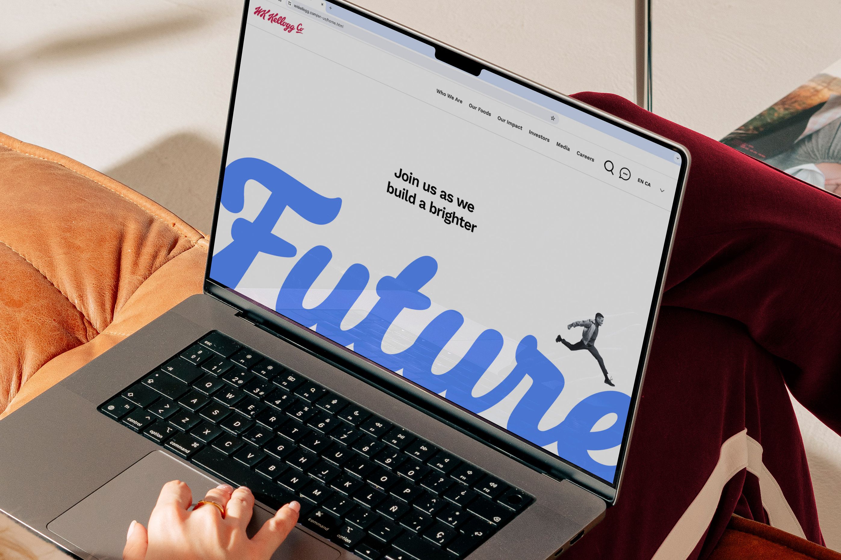
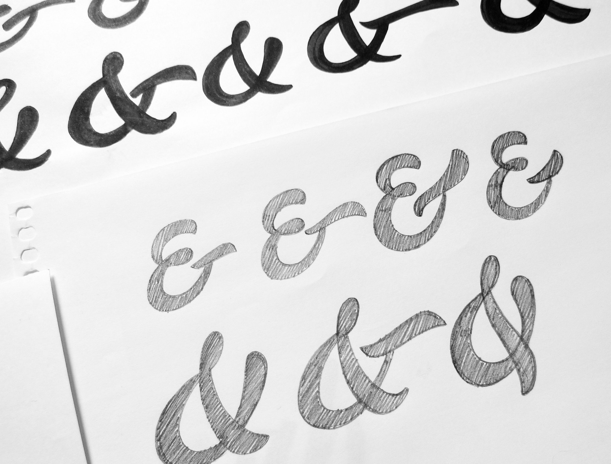
The WK Kellogg Co logo stems from the iconic signature of the Kellogg Company’s founder, celebrating his spirit of innovation and entrepreneurship. We’ve taken his instantly recognizable script, and then underlined and elevated the “Co” to demonstrate our ambition as a 117-year-old start-up taking Mr. Kellogg’s original company to new heights.
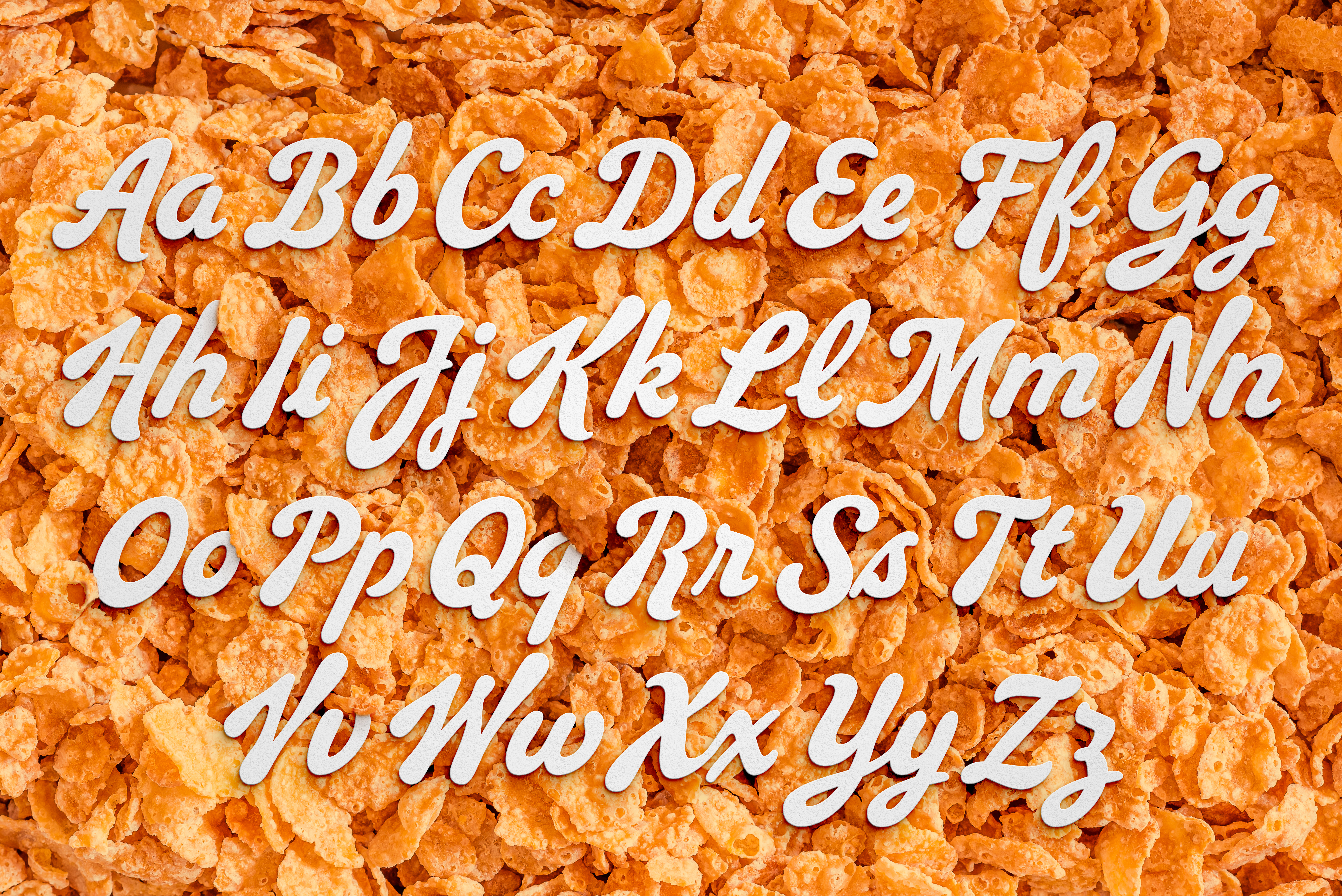
Inspired by the iconic signature this identity continues William’s legacy as well as his pen. Our team collaborated with XYZ Type who created WK Kellogg Script, a custom typeface built off of the Kelloggs signature.
︎︎︎ Click here to see XYZ’s case study on WK Kellogg Script

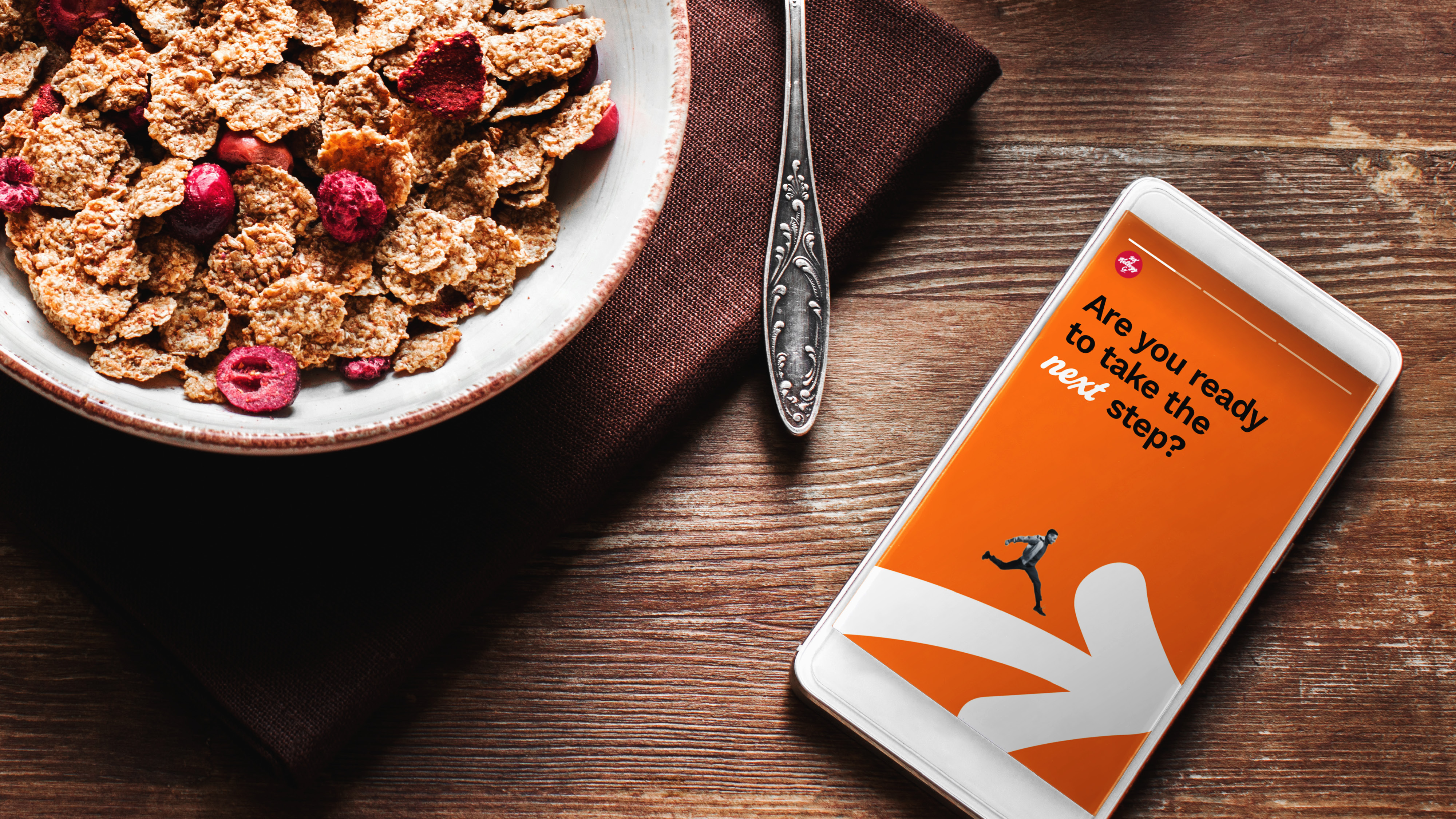
Drawing Connections
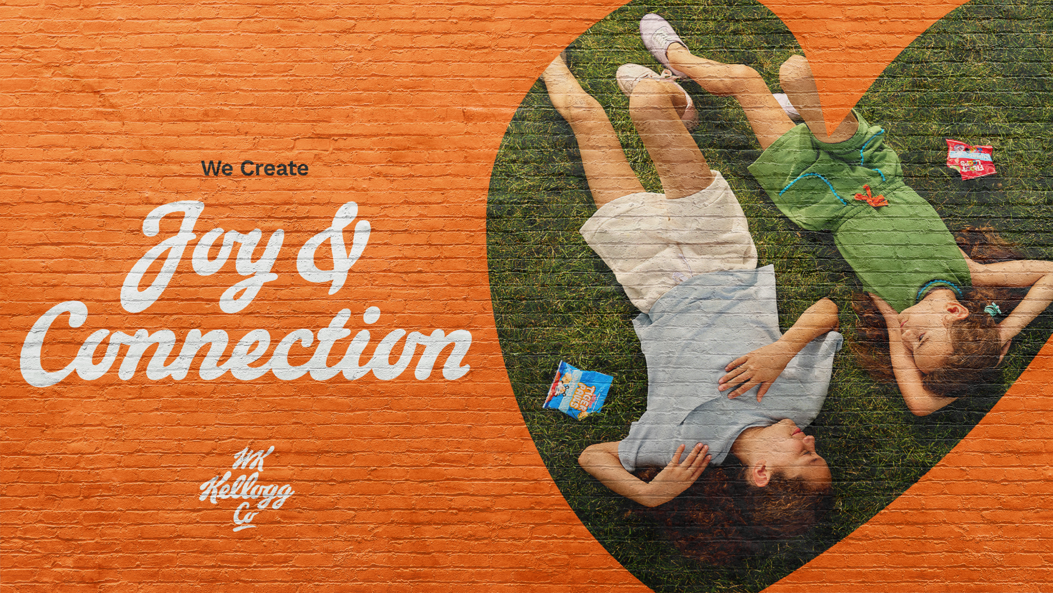
The same pen used to create the typeface is continued into a wide set of illustrations that carry the hand-drawn qualities even further throughout the identity. The illustrations are flexible and serve multiple fuctions as holding shapes for photography, graphic accents for layouts or photography, and serve as a foundation for a set of functional icons.
Building Character